With the new life breathed into the existing Yahoo email Ozstoc group, I thought a fresh new look should accompany the change in pace and direction of the group as well.
With Graham (Streak) now on board as a contact able to produce things like shirts and club patches, the time was right to try a couple of designs to update the logo.
I wanted a design that reflected and expressed a few of the sentiments that I and many other motorcycle touring enthusiasts held dear, and also be a smart, recognisable representation of what OzSTOC was about.
I also had to appease owners of both models of ST.
I like the combination of orange and black.
Were an Australian club.
Soooo
..
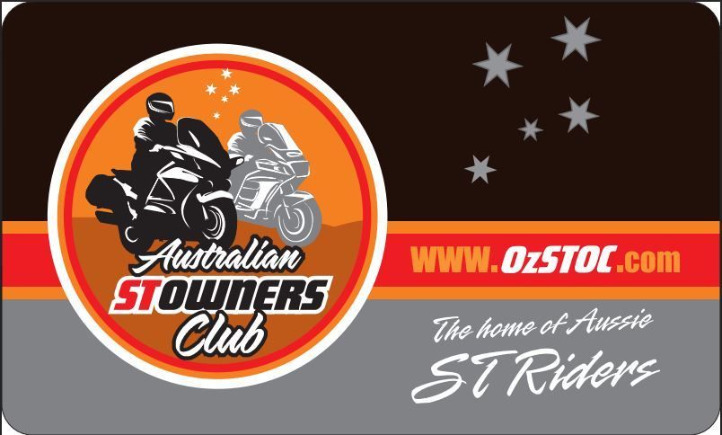
I used ocre as the ground colour to reflect the heart of this wide brown land, and of course, the Southern Cross up in the sky which we all know and love. Of course the bikes went in, and some stylish typefaces to accompany the look of the logo. Thanks must go to Mrs Diesel here who is a graphic designer and was able to computer render the 1100 and 1300 by hand (mouse) for me. The round shape encompassed all of the elements best, and suited production of OzSTOC paraphen
parafan
. gear.
I made two similar designs and petitioned the Members of the old Yahoo email list to see which logo they preferred. They picked the version you see on the website, coffee mugs and Club badges.
Here is how it appears on the OzSTOC Bcard...

The logo has since go through another iteration as an elegant and simplified derivative of the usual logo, as seen on the jackets, caps and new style shirts.
Here is the original OzSTOC logo from waaaay back.

Cheers, Diesel